05
2012Every now and then I get asked to design something (since that’s what I used to do) – and one of the reasons I shifted into photography was in part due to the less-than-stellar images provided for layouts etc. As the years roll by, I built a fairly large image library I can draw from – either for inspiration or to use.
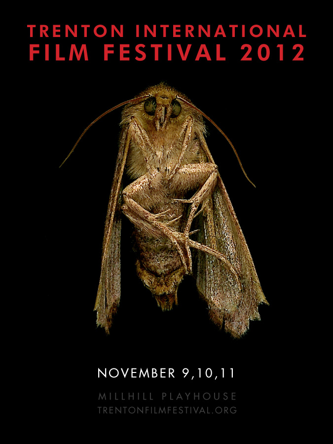
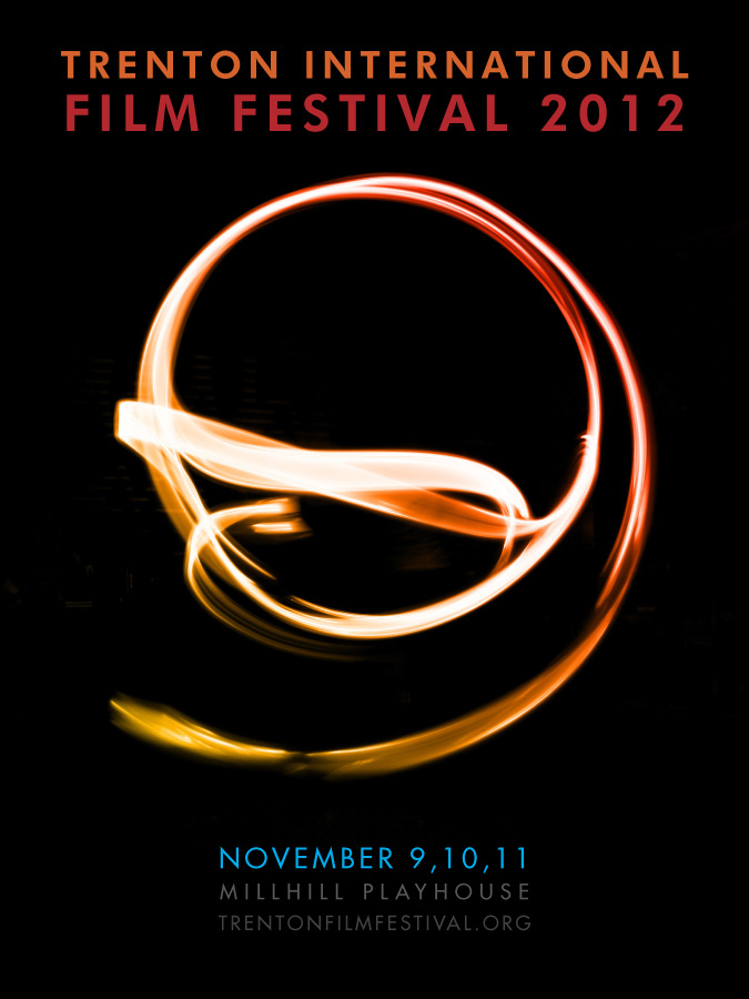
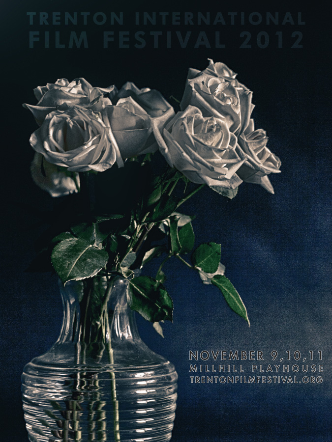
The creative brief I was given for this assignment was, ‘make it gorgeous’ and ‘it has to be beautiful’ – as well as watching the trailers of the selected films. My first thought was to make a photo based series that related to being attracted to light – moth, flower, light painting. After these were rejected, I’m thinking that my ‘beautiful’ is a bit darker than yours. So back to the drawing board to dig some more holes.
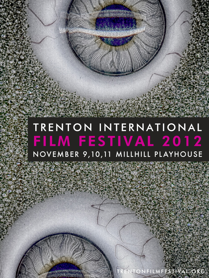
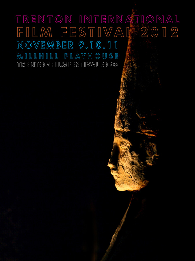
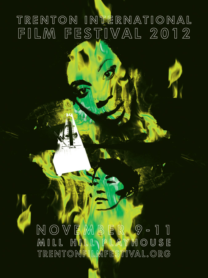
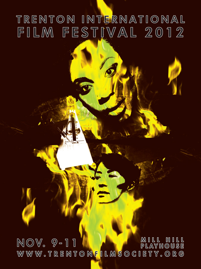
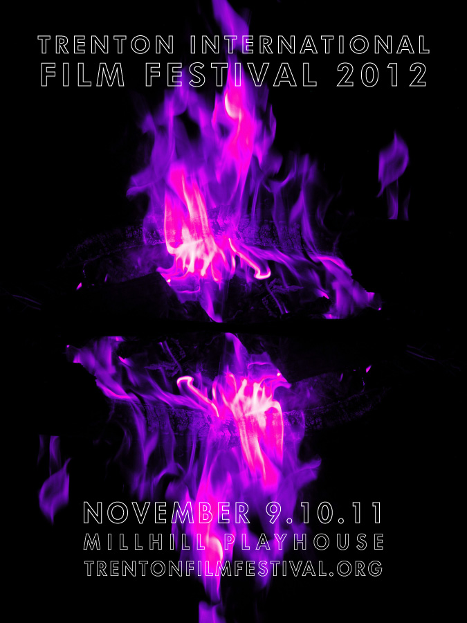
Next round I’m thinking eyes, seeing the light and flowers must be beautiful – right? wrong. The answer was purple fire (originally), which I then made yellow and green, and then deep brown toned – and stuck some heads and a metronome in for good measure (no pun intended). A bit random but I hope it works for its intended audience.
Point of my story, collect random images – they might become beautiful overnight.
Click on the images to see the various layouts at full size.