Menu
Apr
23
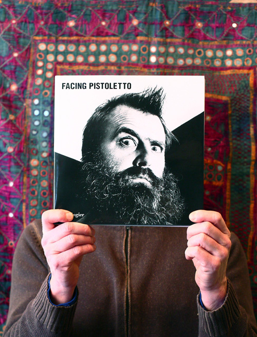
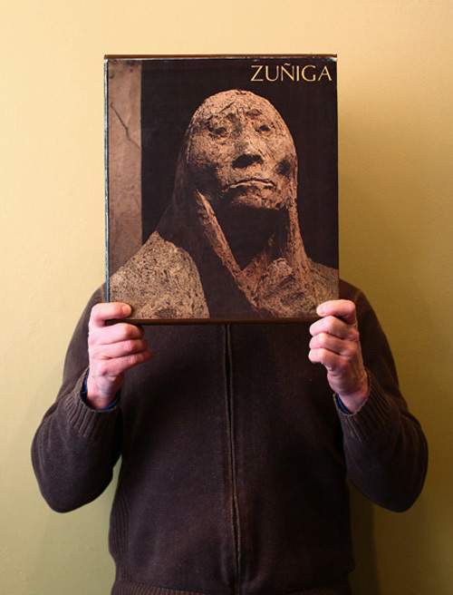
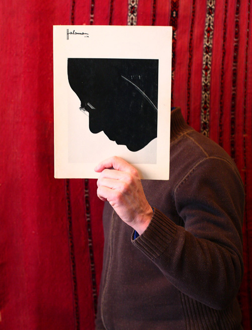
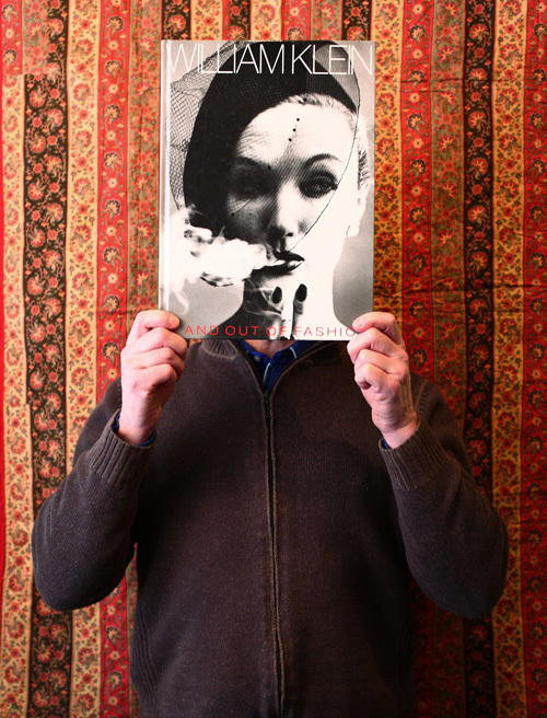
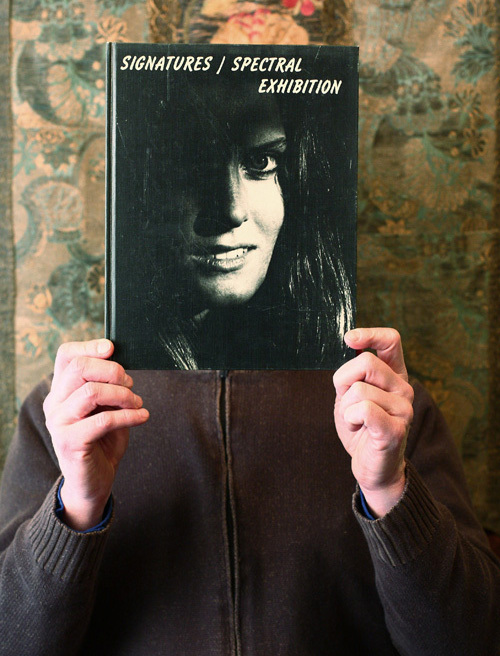
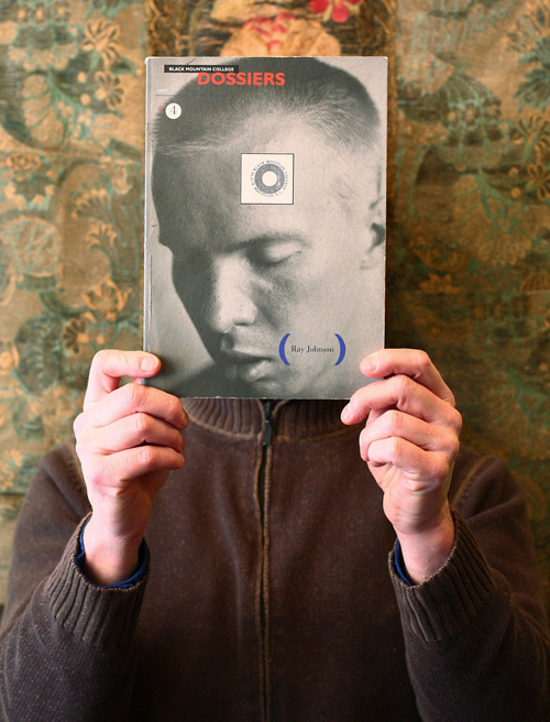
I worked with Panoply Books in Lambertville, NJ to expand their image library for advertising. We had several different tapestries for backgrounds and Roland, the owner, picked out the books with covers that had a face on it. I love it when business owners have creative ideas and need a set of images out of the ordinary. This works perfectly for a book shop – humanizing the product. The idea of series really works well – to have the option to publish a different image from time to time.


Apr
16
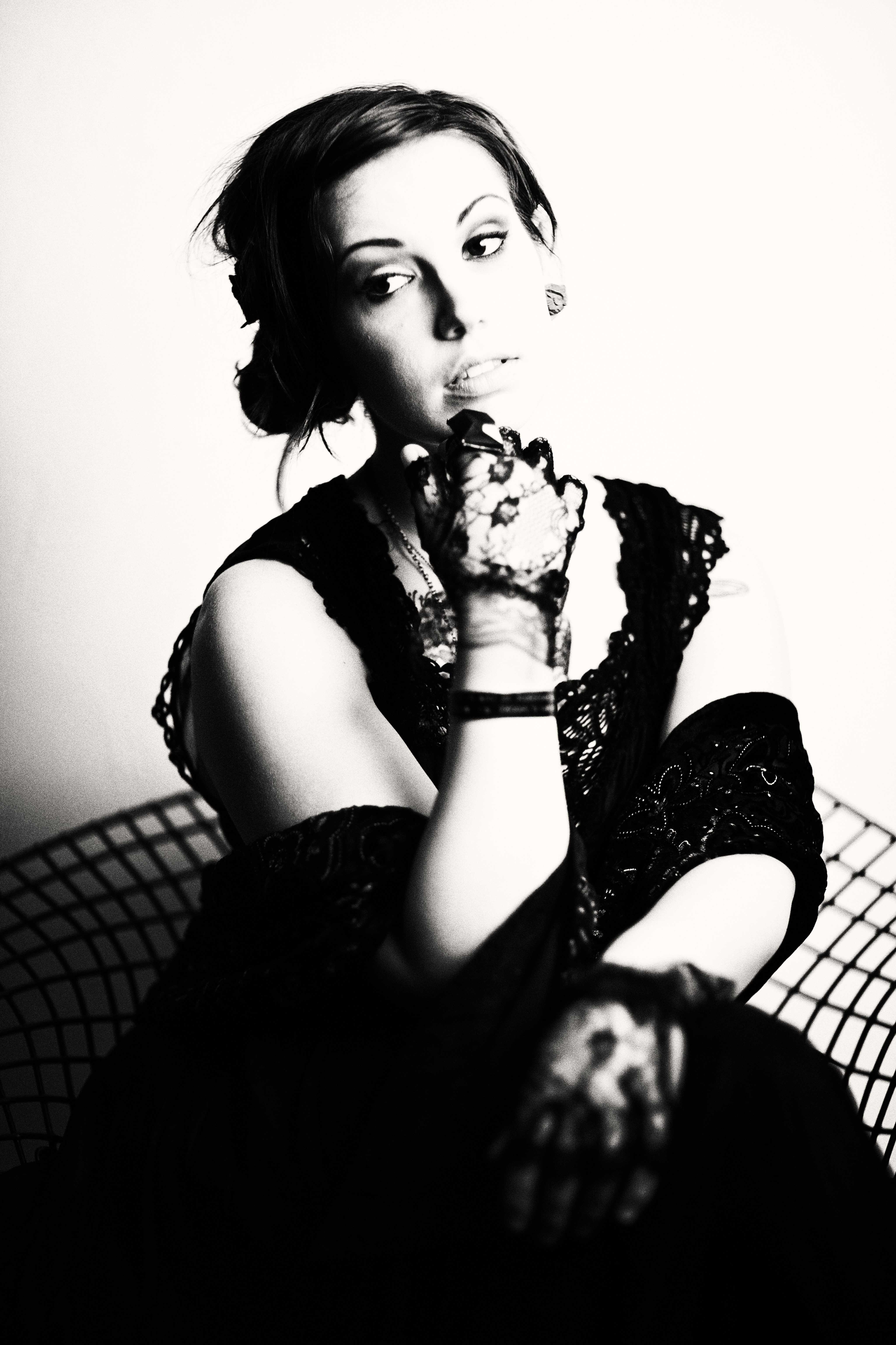
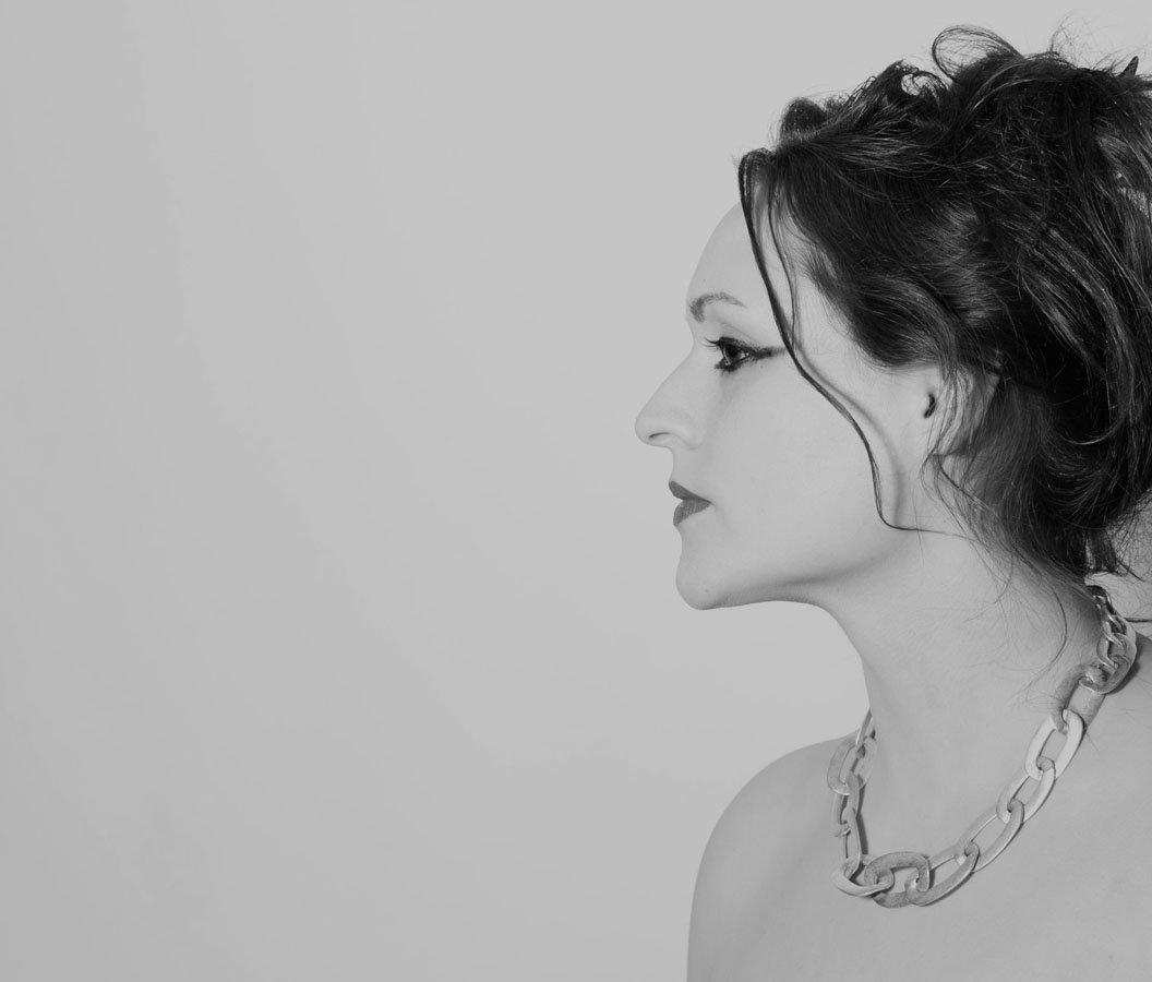
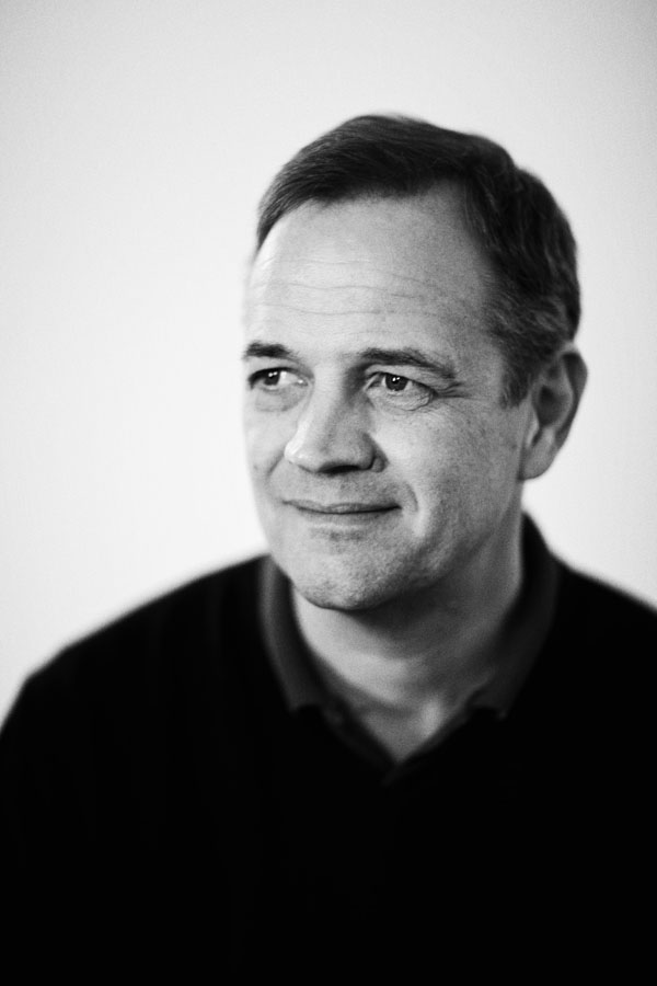
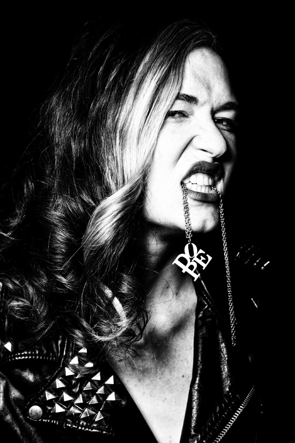
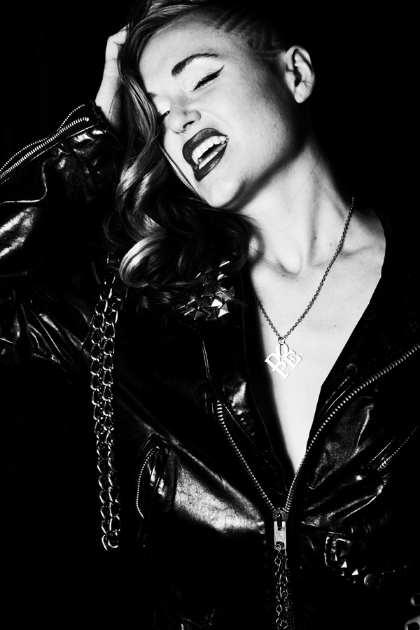
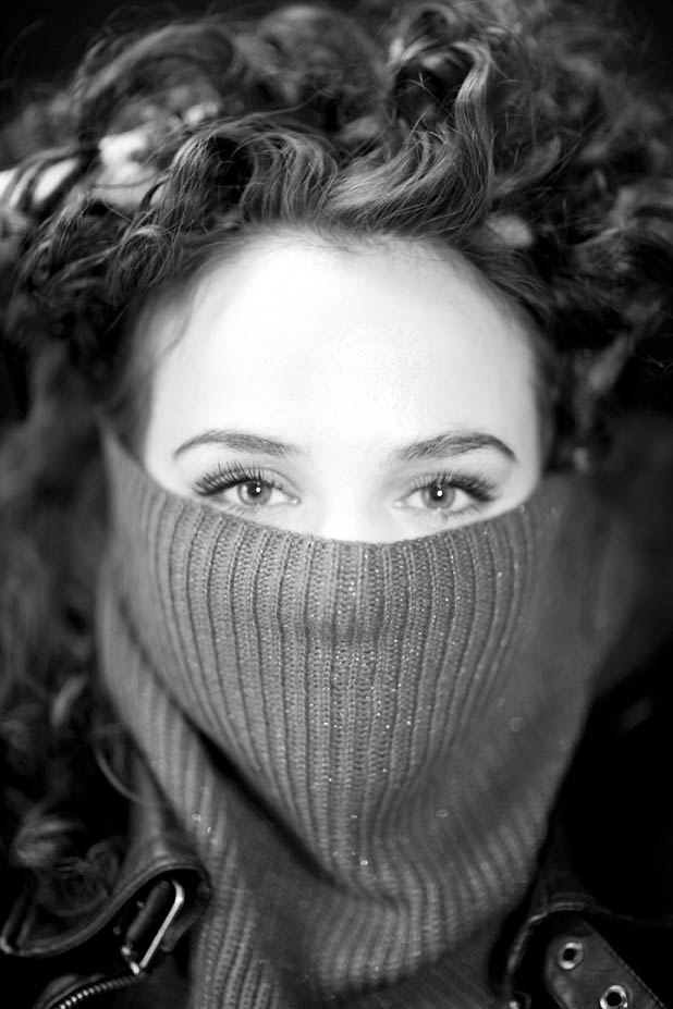
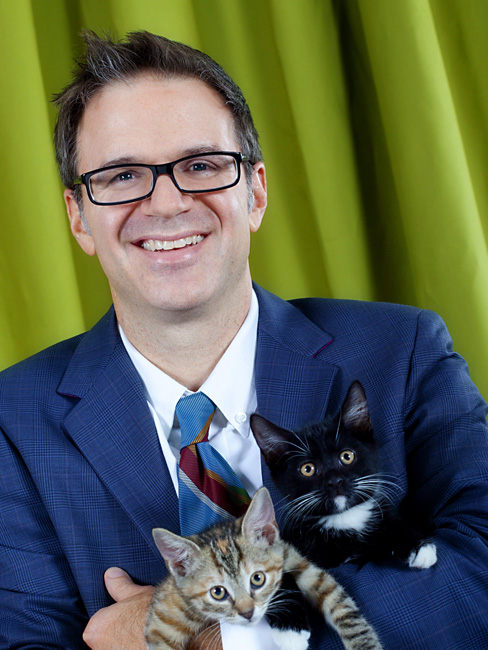
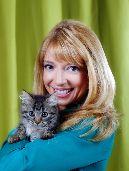
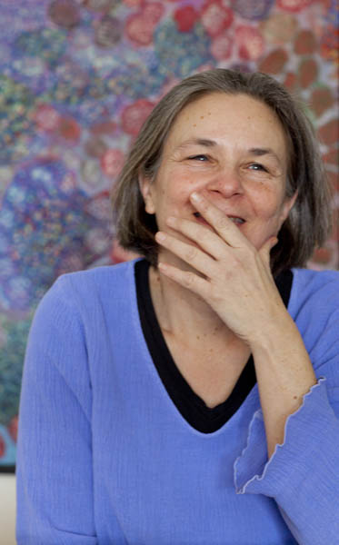
Here is a compilation of a few photo sessions from the last few months. I can’t help myself but to shoot in black and white. Why are we drawn to black and white portraits ? Is it the graphic quality that helps us concentrate on form, or an evenness of tone, without the distraction of color. From a technical stand point I’m learning to really see tone – I can set my digital camera to capture in black and white, but the color info is retained. Staying within the black and white tone range affords me the opportunity to work with subtle alterations of light – and really work with the effects of lighting.The right lighting is the key, and to be able to control the light as much as possible creates satisfying results.
All the images in the slide show were taken in studio with a variety of lighting types. Lately, I’ve been rather fond of this ring flash and bouncing the light into a big reflector – or positioning the subject with the available light and adding a soft light on one side. Thanks again to Dwayne and Molly for styling during several of these sessions.


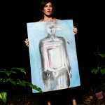
Apr
03
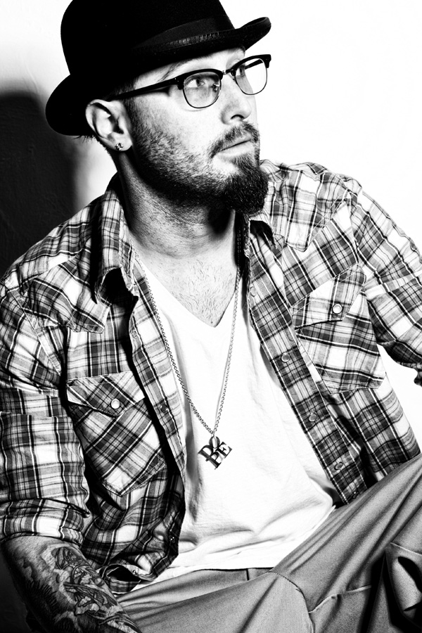
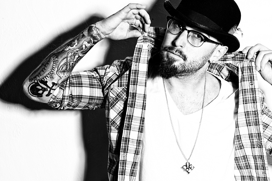
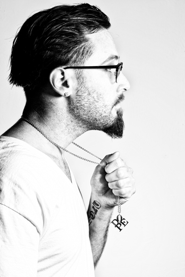
Photo shoot for artist and designer Joseph Bottari. He has been working on series of paintings, stencils and the jewelry pendant – all based on the famous Robert Indiana ‘LOVE’ sculpture. It’s a cool idea to hijack a recognizable piece of art, modify it just enough to make it your own. It’s one of those things that base itself off something already recognizable.
We had two excellent models for the session, Matt and Molly. Both were incredibly creative and great to work with. For this shoot I was mostly using a ring flash – and shooting from the side more than through it. We were going for this stark contrasty look. In this edit, I’m really keen on the poses and lighting – some showcase the pendant better than others – that’s when we decided to get up close have the model hold it high or put it close to their face – so we could get everything in.
I look forward to the opportunity to work with this crew again – we kept going and going, and it kept getting better and better, and later and later into the night – and truly was a collaborative effort.
Learn more about Robert Indiana and go to this site to see more of his amazing art work: https://www.artsy.net/artist/robert-indiana


Feb
28
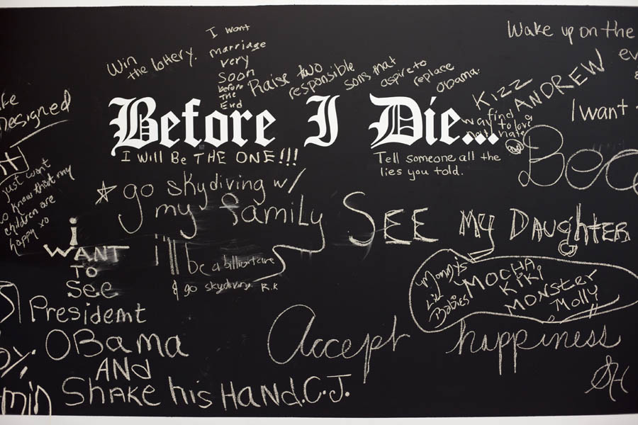
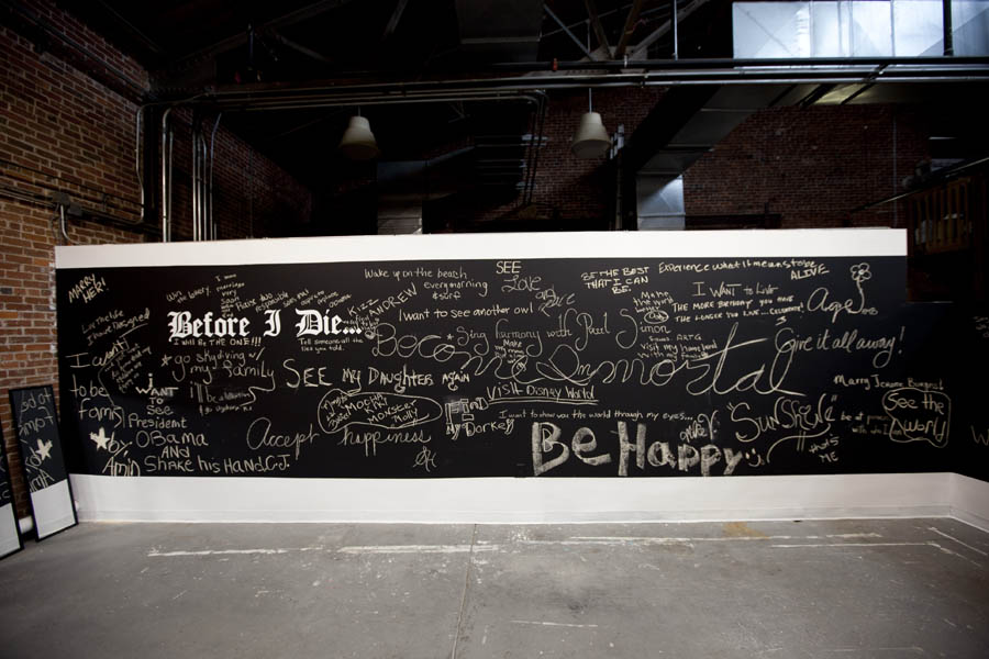
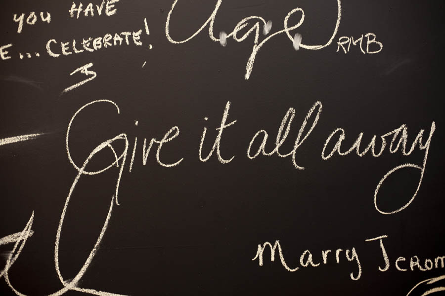
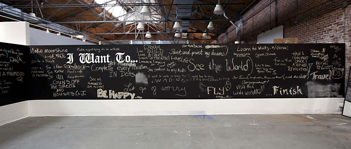
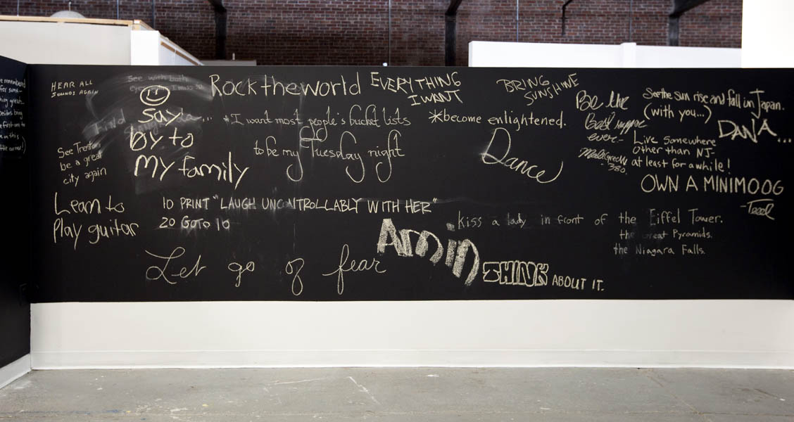
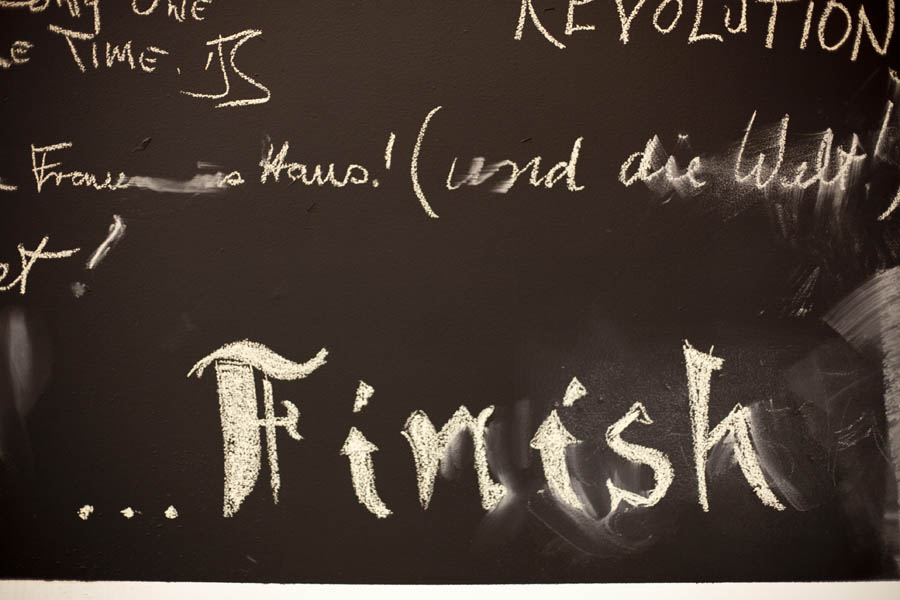
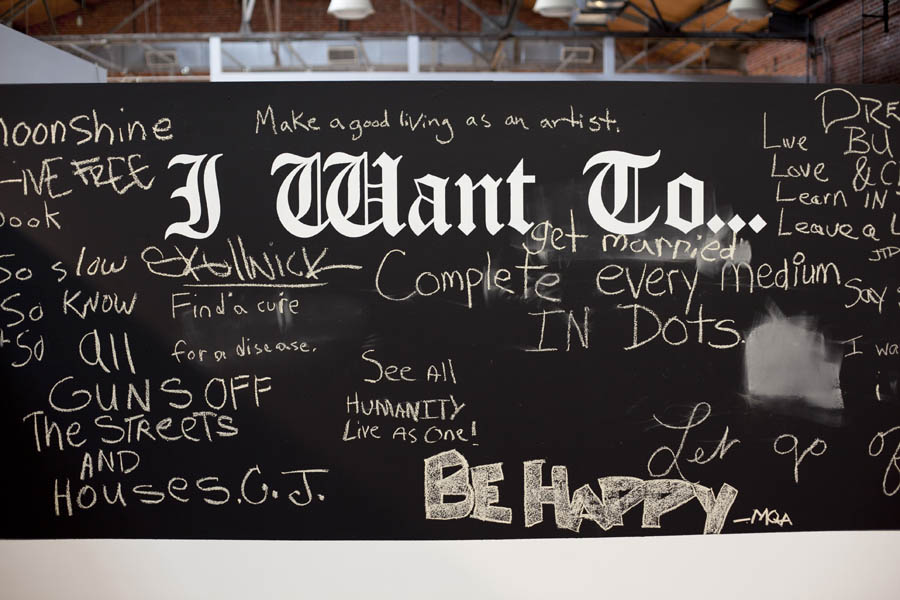
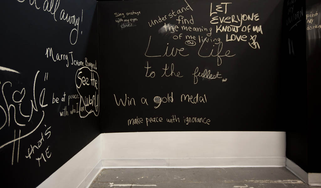
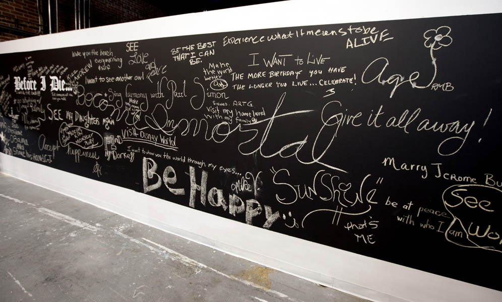
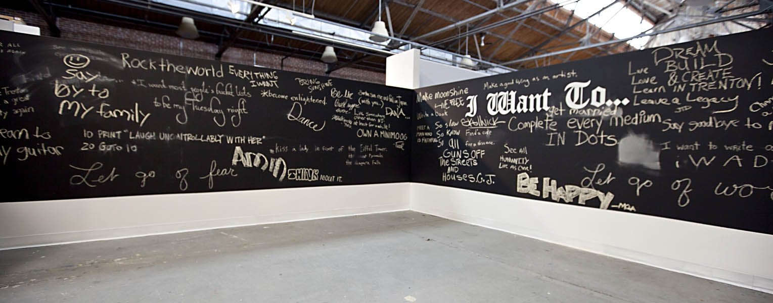
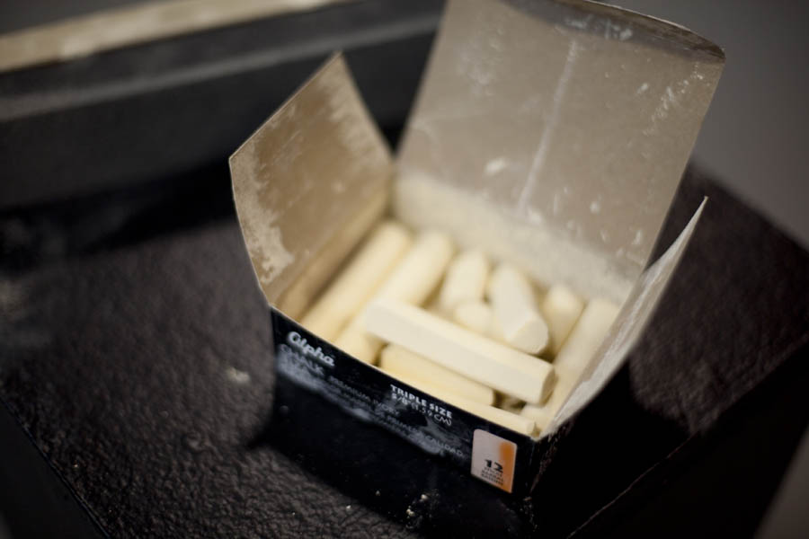
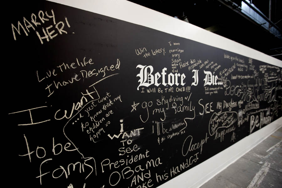
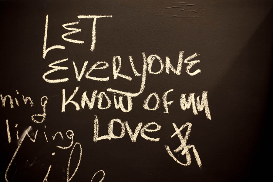
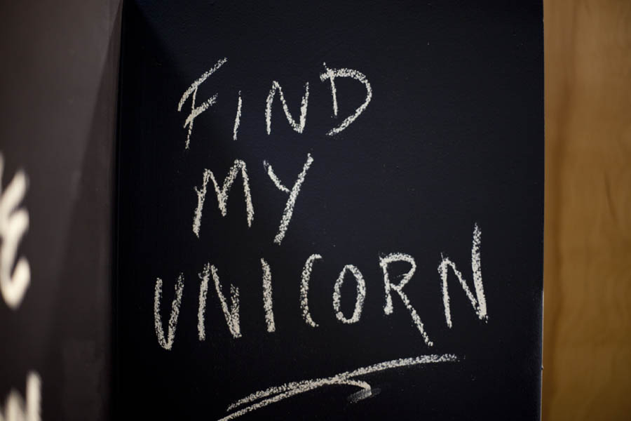
I was invited to create an installation in the ArtLab at Artworks in Trenton. The room was rather large and I wasn’t so sure about building something on-site. So I decided to paint all the walls with chalk board paint and invite the community to write something on the walls with chalk. I called the installation BEFORE I DIE…I WANT TO… which would prompt the visitor to think about what they would like to leave for others to read.
Much to my surprise the room was filled by the time the installation had to be replaced. There were some very funny, sweet, poignant messages left behind for others to see.
Graphology is study and analysis of handwriting, especially in relation to human psychology – and you can’t help thinking about character analysis with some of these messages. Hand writing is a self portrait in type.
Thank you to all those who participated.
Here’s the project blurb:
Before I Die is a community art project where people can share what is important to them by writing a message on the gallery walls. This installation is based on the New Orleans artist Candy Chang. “The wall creates a public space for contemplation and reminds us why we want to be alive in the world today”. Hopefully, participants leave behind declarations, wishes and dreams all to share and remember what is important to them.


Feb
24
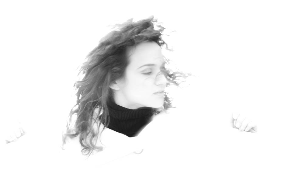
Despite what you think you know, there’s always room for more. Who said ‘The more I learn the less I know’ – [Socrates, perhaps]. I took a portrait lighting workshop and it was fun as heck studying light. We practiced some ideas in lighting that I’d have never considered. Thanks to Frank V., the instructor for the Lighting Workshop, and the Princeton Digital Photo Workshop.
A few shots in this series were lighting experiments with this hazing effect. We put a strobe behind the models head (on quite high power) and she faced the windows for additional ambient soft fill light. Then, using a slow shutter setting on the camera, the model flipped her hair back and forth and up and down. We think the hazy glow came from the strobe bouncing off the wall (it was very close to the wall), and back into the camera. Quite a romantic effect – without the use of any digital filters. I don’t know that I’d have thought to experiment this way if it wasn’t for the workshop. So this old dog has new trick.
As for the image that is both in black and white and color, I still can’t decide which one I like more – I should probably take a photo editing class next.


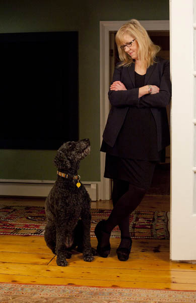
Dec
05
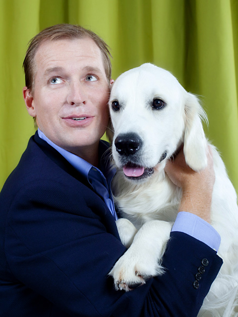
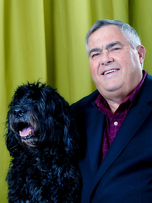
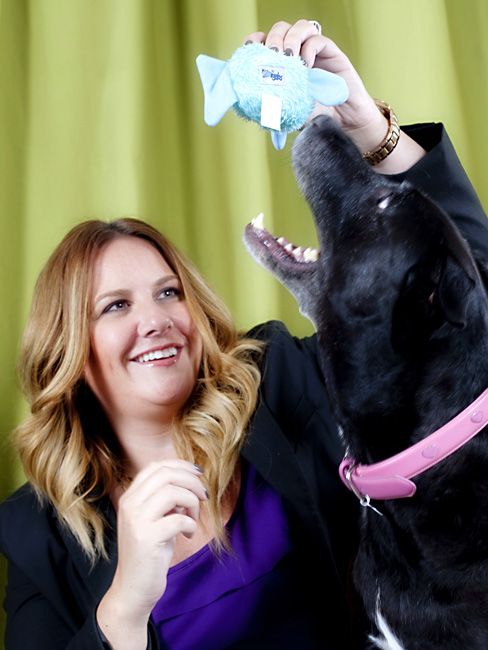
I thought about calling this series ‘EXEC_CUTE_TIVE LEVEL’, but then DOG YEARS felt better.
We’ll Make Great Pets, the song by the band Porno For Pyros (Perry Farrell of Jane’s Addiction) was playing in my head the whole time. And continues when I look at these images. Understanding relationships transcend the test of time and institutional struggles. A thought that was also playing in my head after this photo session.
My friend, a Creative Director who offered me the shoot was challenged after the fact (by upper level execs) about decisions that were on the table months ahead. Things that were previously approved, became politically unapproved. And like ‘man’s best friend’ – we stuck it out, and made everything work to the best of our ability. There’s more to ponder about the parallel of pet and owner, and two friends that have worked with each other for over 15 years – that’s 105 in dog years.
On this shoot, we were lucky to have the budget to accommodate a very talented stylist – Dwayne, who did the hair, make-up, pet wrangling and set-up.


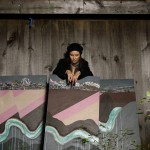
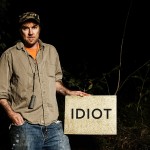
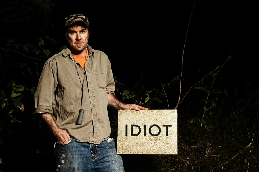
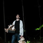
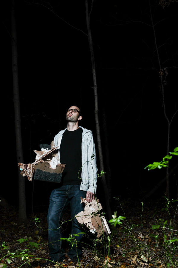
Oct
26
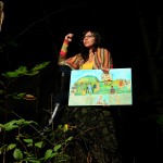
After Burn was a project I was asked to participate in the Fall of 2011. The concept was borrowed from a group that once a year would have a back yard fire and invite artists to bring one piece of their own to chuck on the fire and be rid of it – love it. Although the attendance of our Burn was a bit light, the collaborative minds were engaged – initially – with seemingly hidden agendas unraveling. Which begs the question, can artists’ be curators? Or, is it best for that not to happen. The mix at this burn was primarily artists, save for a few with fairly decent community organizing skills.
My interest was to take portraits of the artists’ with their art in the woods – before burning it. That was the only way I would be apart of the project – and believe me, I had plenty of art I could burn at a moments notice. This was a fun challenge, since I very much enjoy night photography, and the subject matter was truly great.
The thought was, that with the photos, the amazingly cool slow motion video that was made, and a potential project made out of the ashes – all this content would be ready made for a gallery – some or all. Believe me, the video footage was by far was the coolest thing you ever did see – and probably never will. The majority of the burners work jobs as well as making art, nobody really has authorship of the project – shame.
I am glad to have this little set of portraits of the folks involved at least. Art collaborations can have the best of intentions.
-
- GREEN

-
- DE LA GARZA
-
- PRICE
-
- SANTORO

-
- WILKINSON
-
- BALDWIN
EDITOR’S NOTE: I changed the text on my glitter painting – too embarrassed to publish the original – it was a really bad idea – glad it burned.
Jun
13

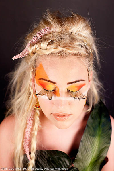
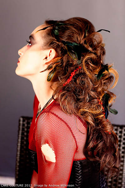
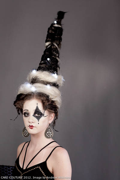
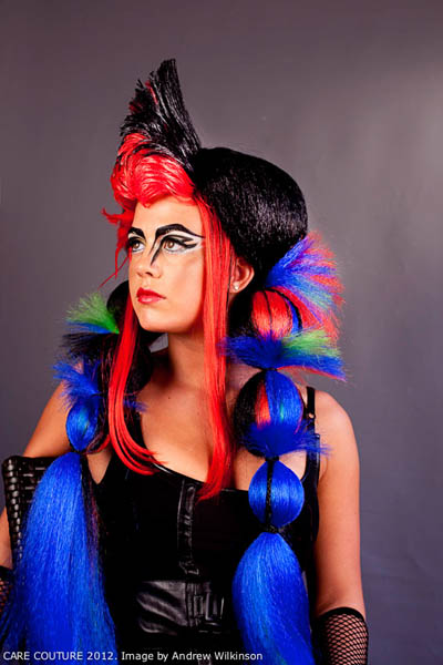


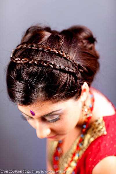
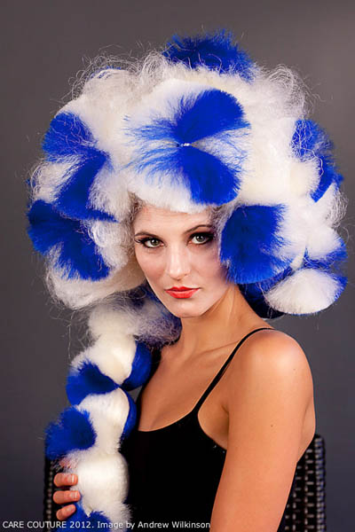
Lucky me (again) I was asked to photograph lots of models and gals from hair salons for an event called Care Couture, which is a fundraiser for cancer survivors. All the funds raised are given to directly to the folks that may need to purchase a wig after chemotherapy. This year there were over ten hair salons that participated and each salon provided the models. The salons did an amazing job – hair / make-up / concept – everything. I set up a back drop and lights in a side room at the club where the event was held. And weirdness – my light broke again – that happened last year as well, but lucky me (again) I have a fleet of prime lens’ that can basically see in the dark.
This event is created by an amazing crew that volunteer their time and energy – from the PR firm, the club manager, the DJ, lighting guy, photo-guy (me). This year I recruited a video guy, another camera guy and photographer that set up a photo booth – very cool. And there were dancers as well – to set the tone of the themes between the fashion show cat walk part.
The air conditioning was broken that night on a somewhat-more-than-warm-night in mid-June and I was stuffed in the side room with 20+ models, Denise (stellar assistant) and Bridgette (where did you go?) – and no one uttered a peep – no divas – no complaints. Me? I was sweaty as a mouse.
May
01
-

- Susan Wheeler
-

- Timothy Donnelly
-

- Ellen Foos
-

- Alicia Ostriker
-
- Carlos Hernadez

-

- Mark Doty
How best to photograph a poet? The dexterity to play with language intrigues and impresses me to no end, since I’m rather challenged at decoding poems. They puzzle my mind – but I’ll keep trying. So lucky me, I got to work with Susan Wheeler, Alicia Ostriker, Carlos Hernandez, Ellen Foos, Mark Doty and Timothy Donnelly – I hope I captured their image in a way they like. Environmental elements become clues that hopefully help tell the story of the subject. Obvious vs. obtuse. As a photographer I aspire to understand space, as well as color and light.
I’ve heard a good idea is bad idea at the wrong time. This assignment could have been that with the amount of ‘ions in this fire’. Ions, not irons. That was a poetic attempt. A photographer should the edit space as does a poet. Add in editors, publishers and designers – and the space can change. Ionic, not ironic. That was another attempt. Perhaps I haven’t learned enough about id, ego and super ego – and should stick to taking pictures instead of writing.
Apr
16

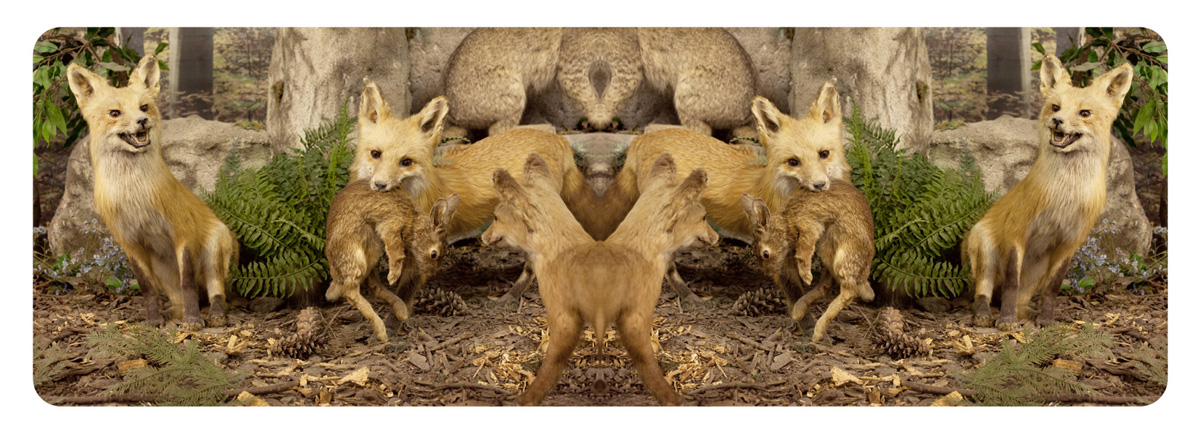
I spent the weekend with a bunch of strangers that had one thing in common – a passion for photography. Peter’s Valley in Layton, NJ has a weekend retreat for all levels of photographer. The never ending debate about about film vs. digital rearing its ugly face around every dinner table continues. It’s great to see view cameras employed, hear about technical prowess – and participate in conversations about our favorite photographers and learn of ones we didn’t know of.
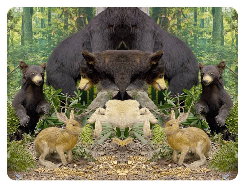
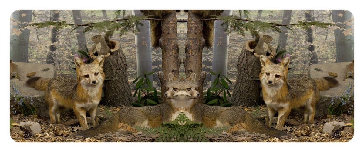
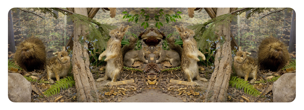
How many photographers does it take to shoot a barn? Of course everyone sees and works differently no matter the subject. Took me a minute to find my feet in this place and despite the mild isolation I was more interested in the touristic aspects of local natural spectacles. Something about nature providing and being capitalized on.
The one place I visited had a diorama of taxidermy animals – all the things you might see in nature, but stuffed and displayed in one room for your viewing pleasure before you pass through to the natural feature you just paid to see. The staff didn’t seem to mind me work the room. I decided to flip and mirror these images and create a joined stereoscopic image, since the sets are already so fake and lit with overhead flourecsent lights – it’ll never look real no matter what you do – so I decided to the draw the viewer further. Naturally your mind tries to make sense of something that doesn’t.
What happens in the Poconos looks like it stays there.